GDF Files
Revolutionising the flow of Fugro’s
data transferring web application
PROJECT OVERVIEW
Geo-Data Factory Files (GDF Files) is an internal web application used for data transferring without having to connect to a network. The product was still in its earlier stages having active users within the Americas with expectations for its use to be global spanning across all of Fugro’s business lines. My role for this product was to incorporate new features requested by users that would help them improve their experience with the product. As it was a heavy data-driven product, the UI improvement was not the highest priority of the product but rather, understanding the feature users would need and what that would look like.
TEAM
Stephen
Sascha
Jae
Development team
Regional processing team
Product Manager
Product Owner
UX/UI Designer
TOOLS
Figma
GDF Files web/desktop application
TIMELINE
August 2023 - Present
THE CHALLENGEElevate a global-led product
Before the introduction of GDF Files, Fugro workers would manually write down data from the remote field they were working on and then take that information back to the office to be uploaded on to a system. GDF Files has revolutionised this workflow allowing remote workers to upload the data straight to the cloud saving time, money and resources. This was the reason why GDF Files is a crucial project for Fugro as it would affect all of their business lines and not just in the innovation department.
DISCOVERUnderstanding the user flow
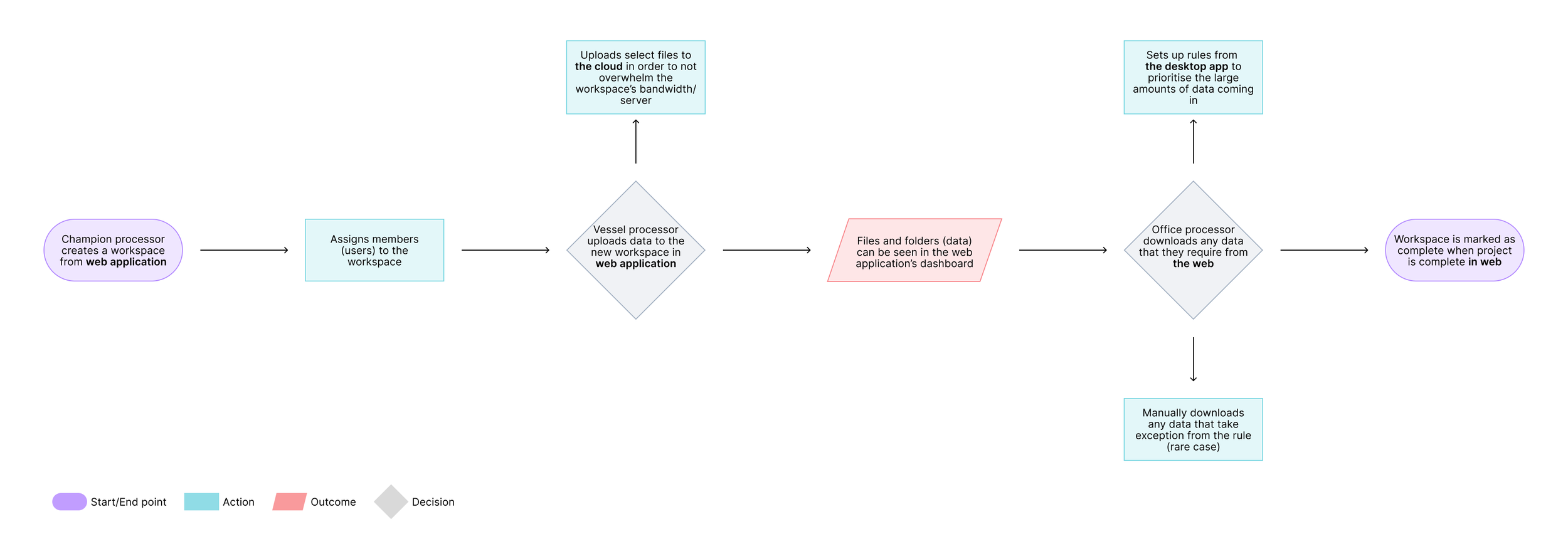
At the time I joined, GDF Files was divided by two applications; desktop and web. A ‘champion processor’ would create a project or a ‘workspace’ for offshore users to transfer data to the office users who would receive it. A lot of data is transferred in a workspace and so in order to prioritise and filter the data coming in, office users are able to set up ‘rules’ from the desktop application and the outcome of the transfer rules are seen on the web application.
In order to better understand their thoughts on this current flow of transferring data, I set up user interviews speaking to both offshore and office users and the champion processor. After asking two specific questions, below you see the general consensus from our users after synthesising the notes taken from each interview.
“How do you feel about the current flow of transferring data?”
“Is there anything that could improve your experience with this feature?”
Users felt content with the overall flow of the data sharing process as it was fast and efficient. They liked how they were able to conduct the transferring process from wherever they are.
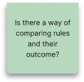
They questioned whether there was a better way to create transfer rules and wondered if it need to be separated from the rest of the flow.
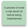
Users felt confused in the way they set up the rules as the method of creating rules seemed complex and having to switch between applications to see whether their rule was implemented correctly.
DEFINE
Operation move to web
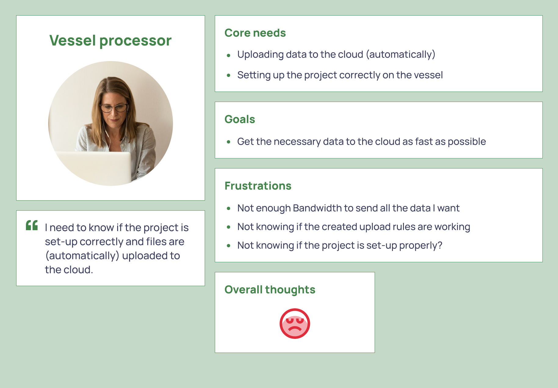
I proceeded to create three personas in which the champion processor was our main persona as it was their role to set up and support our users with their workspaces. They also gave constant feedback to our team based on what is said about the product from the users.
From creating these user personas, we established our target audience and our problem statement for this feature.
“How can we transform the way users set up their rules in the data transferring process?”
Now that we understood our target audience and the problems they were facing, I identified 3 opportunities that would drastically improve the user experience. After receiving technical input from the team to see whether these solutions are possible or not and directional input from Sascha the product owner, I concluded with the following proposals.
Desktop to web
Move the whole operation of setting up a rule from the desktop to the web application. Users mentioned they were satisfied with the whole transfer process so the challenge was to add in this new feature without compromising the rest of the process.
UI Redesign
Converting the feature to the web application meant that there was an opportunity to redesign and improve the UI as it got implemented.
Updated approach to setting rules
The existing way of how rules were set up was confusing and difficult for users to understand forcing users to almost learn a new keyboard language for the process and so a more user-friendly approach was required.
IDEATEThe updated flow
As the goal was to move the user flow to the web, I had to better understand how the desktop application worked and so I created another user flow chart focusing on how users manoeuvred through their way around the desktop when creating a rule.
Through capturing the essence of the creating rule process, I translated this to a mock-up highlighting what it could look like when converted to the web application.
I took into consideration the pain point users felt of the current way rules were set up and worked closely with the development team to better understand how we could improve this.
Our proposal was to eliminate the need to enter specific keyboard jargon to set the rules and instead replace it with a dropdown menu with categories users must choose from followed by specific instructions the transfer rule must follow.
TESTINGThe validation
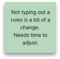
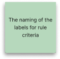
It goes without saying that as much as the team and I were confident in our ideation, our proposal had to be validated by users as moving one step to another for users was expected to be a big change. So I went back to them and pictured a scenario of creating a rule for a workspace to them and proceeded to show a step-by-step process of the proposal asking them open-ended questions. The feedback was recorded, noted then categorised on an MVP basis.
“What do you expect to do after this step?”
“What does this step mean to you? Would you change it? How?”
FEEDBACK
NEEDS REVIEWING
NICE TO HAVE
THE OUTCOMEBringing it to life
Below is the end result of addressing the pain point users were experiencing with the whole data transferring process. Although the build of this design is still in its infancy, beta version of the feature was tested on existing vessel users with remarkably positive feedback. It was still too early to determine the business value of this feature however what we were able to achieve was:
✔️ Eliminate the complexity of setting a rule resulting in easily understandable approach to setting one
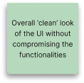
✔️ Incorporating a feature in to the overall flow of the transfer rules process without compromising it resulting in efficiency and familiarity
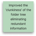
✔️ An improved design of the feature resulting in its clarity and overall better user experience
CONCLUSIONA hope for the future
Being a very data-driven product, it was understandable that there was a lot of work needing to be done from the development side and so a UI redesign of the web application was never a priority for this project. However, ‘the designer’ side of me could not help but leave a glimmer a hope for the future that one day the UI will also get a much needed update. So, I finished off this project with my own rendition of a redesign based off my own understanding of the product as well as input from both the development team and active users.


