
Titan Design System
Part of the core team that built
Fugro’s first ever Design System


PROJECT OVERVIEW
At the time I joined, Fugro lacked any formalised Design System despite a growing team of designers working on individual projects causing designers to create their own source of standards for UI elements, components and foundations for their projects. So, the designers in APAC region including myself joined together and set out to create a single source of truth that could be accessed by anyone and utilised by everyone for their projects.
TEAM
Francesca
Jae
Milena
Laudair
Design team lead
UX/UI Designer
Senior UX/UI Designer
Front-End Developer
TOOLS
Figma
Storybook
TIMELINE
October 2022 - Present
Revolutionise the way products were to be designed
THE CHALLENGEAlthough Fugro has various forms of business lines, in its innovation department, it is a data-driven company. Data-drive meant that a team of developers are involved to manage internal and external client data and designers have their part in ‘translating’ this data so it could be understood by anyone internally and externally.
“The problem was that designers were not considered from the beginning of a project but rather in varying stages of one”
This caused designers to be inserted into projects without a common design language to depend on for their assigned project resulting in:
Conflicting guidelines and lack of direction
Duplication of common components
Inconsistencies between projects
Isolated teams with disjointed communication
So through this dilemma came the idea and through the idea came the challenge:
“How can we build a design system that is simple, scalable and understandable by both designers and developers?”


DISCOVERThe needs and don’t needs
As a team, we conducted a design audit compiling a list of components used in our projects that can be converted in to our Design System.
We created a hierarchical list based on how often a component was used in a project as it showed its level of priority.
We then categorised our list which resulted in carving out our product’s roadmap.


DEFINE
Setting the foundations
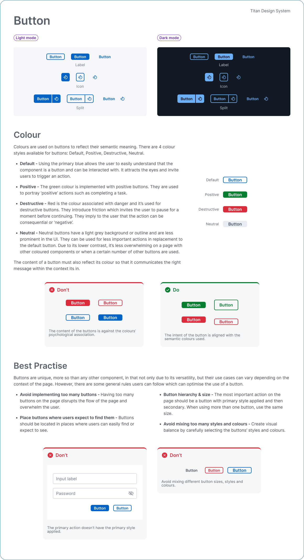
Before diving in to our components, we focused on working on our foundational elements such as colour styling, typography and spacing. Our colour styling revolved around the company’s core colours where we created a branded palette that was:
Flexible in both dark and light themed frames
Maintained a global interactive, neutral and feedback palette
Supported contrast accessibility
Once the colour palette met our criteria, we converted them to colour tokens and created a guidelines page to record our journey. The principle also applied to both typography and spacing. Like everything in our design system, our foundations library is constantly evolving depending on the company’s requirements and even today we still discover cases to introduce a new token and tokens that just don’t work with our designs or underused.


RESEARCHHow we approached the build
As we were a much a smaller team, we were challenged to take on larger responsibilities that other Design System teams would otherwise split into smaller roles. My responsibility was to research and create the first iteration of each component which was then reviewed by our team. My approach to each build was to research best practices and then combine that with Fugro’s requirements from each component. I opted to use the ‘Atomic Design methodology’ as it allowed design flexibility and convenience in keeping track of the build process.

IDEATEIt’s all in the details
Once I had a general idea of a component, I would then create a first iteration which was then reviewed by the team. After receiving feedback, I included in the component’s properties to to its shape factoring in:
The expected behaviour of specific cases and what that behaviour looked like
The sizing and states
The properties required that would cater to the existing projects
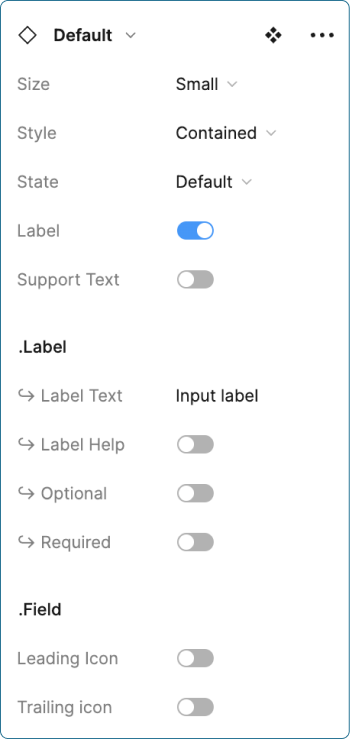
Each component had a specifications and example pages to visually coincide with the variants of the component.
Note: Before Figma introduced ‘Dev Mode’, I created a specifications page to help developers better understand the spacing, padding and tokens used.


Sidenote
From the time I joined Fugro, our team’s schedule was set so that priority was to work on our assigned projects but 30% of our weekly time was separated for working on the Design System. This all changed after more than a year in after we presented our progress through a Global Demo in which we received very positive feedback from stakeholders. Our Design System was recognised as a product of its own allowing not only other products to access and utilise our component library, but we were also able to offer our Design Thinking services to any interested products.
Note: Below are a few slide shows from our presentation however a full video recording is available upon request.


“We went from a team working on products to a team working for products”
PROTOTYPEBack to the problem
Despite our recent success, we were still facing many obstacles with our product. Our biggest challenge was that we still had to guide front-end developers from each team we were in on the details of each component resulting in their own interpretations. In other words, we were still lacking the consistency and the Global Design language we set out to achieve. This was when Not long after, Laudair our front-end developer joined our team and we ran through a review of what was existing in our library and made alterations based on a developer’s perspective. Once reviewed, Laudair converted our library into React components as most products in APAC were using React. Our components were also documented separately into Storybook so that developers and anyone interested were able to conveniently copy + paste the code and also test the properties available.


TESTINGRecording and guidance for all
Despite being a small team, we knew we had to scale our growth as more projects would eventuate to more users having access to our design system. We had to consider the range of users as well as it wouldn’t just be designers who would import our library to their project but project managers and product owners who would use our component library as reference for their projects. So we documented a methodology on our approach on how we built our design system highlighting:
The atomic design approach to building a component
Accompanying guidelines and examples
A backlog page for any bugs or functionalities that were out of scope
A versioning page to record updated design


CONCLUSIONThe lessons learnt
Building a company design system was an incredibly rewarding and compelling experience with a lot of trial and error, problem solving and learning along the way. Some take aways I have learnt from this experience is that:
Design systems are evergreen: They are living systems that require a dedicated team actively involved in their growth and maintenance. Facilitating adoption and cross-team buy-in is a challenge worth undertaking that ensures we all are presenting a common design language, that is familiar and consistent for any person interacting with it.
Design systems will never be perfect: A Design System is the design language used for an organisation. This means that although applying best practises and foundational research were a good basis to build a library, you will truly never know how a component would be best utilised until it is in multiple different project environments. On top of that, styling and the way components are used can change over time. We are in an innovative industry after all.